To make diagrams easy to generate, you won't have to guess how big to make your shape for your diagram. The shapes are sized automatically using built-in intelligence.
By default a shape is 1.5" wide x 0.75" tall. This is its minimum size. You can place text, tables and other shapes inside a shape. The shape will automatically grow to accommodate its contents.
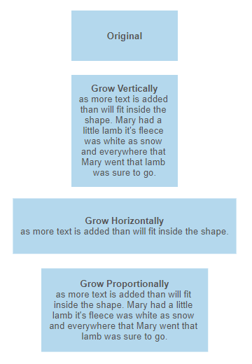
The way a shape grows to accommodate more text than will fit is determined by its "TextGrow" property. This can be any of the following values:
- Vertical: The shape grows vertically to accommodate more text.
- Horizontal: The shape grows horizontally to accommodate more text.
- Proportional: The shape grows proportionally to maintain its aspect ratio to accommodate more text.
If the property is not defined, the shape will grow vertically by default.

ShapeContainers grow to contain their child shapes plus a border of empty space that is 0.5" by default.
Shapes that contain tables grow to exactly fit their tables. The text in table cells grow the cells based on the TextGrow property for the shape.
If necessary, the minimum size for a shape can also be overridden. Using the MinWidth and MinHeight properties.
The first thing to understand about controlling the way a shape is drawn using VisualScript is that you don't need to! There are smart default values set by VisualScript. You only need to worry about the properties of the shape, if you'd like something other than the default values.
The markup describing the visual will be interpreted by an intelligent formatting engine that generates that diagram using a template.
You can control which template is used with the "Template" command, but by default the blank diagram template is used. The template has defaults for all the properties of a newly created shape: color, font, border thickness, and so on.
Because of this, no properties need be defined to create a shape using VisualScript.
Using the SDK method AddShape() is sufficient to add a shape with defaults
that match those specified by the template (or in VSON the empty object {} does the same thing).
You can override these defaults by specifying property values explicitly.
The AddShape() method creates the following object on the page:
- a rectangle
- 1.5 inches wide and 0.75 inches tall
filled with blue
- has a one pixel dark gray border
- has no text

The way to change the appearance of a shape from the default is to add properties to the Shape object. For example, you can choose a fill color.
{
            myShape.SetFillColor("#FFCC66");
            }
You can define a border color and thickness.
{
            myShape.SetLineThickness(4).SetLineColor("#CC3333");
            }
You can also add text to the shape with a "Label" property.
{
          myShape.SetLabel("This is a text label");
          }
The font can be controlled with additional properties like size, style, and weight.
{
        myShape.SetLabel("This is a text label").SetTextSize(18}.SetTextItalic(true);
        }
You can combine all these properties to fully customize a shape's appearance.
{
       myShape.SetLabel("This is a text label").SetTextSize(18).SetTextItalic(true).SetFillColor("#FFCC66").SetLineThickness(4).SetLineColor("#CC3333");
       }
A shape doesn't have to be restricted to a single fill color or one label. You can divide a shape up into a rows and columns using a table.
You can add a table to a shape object with just a few commands.
{
    myTable=myShape.AddTable(2,3);
    }
Each cell in a table, behaves like an individual shape. It can have its own label, fill color, and so on.
{
    myCell1=myTable.AddCell(1,1);
    myCell1.SetLabel("This is a cell label");
    myCell2=myTable.AddCell(2,2);
    myCell2.SetFillColor("#FFCC66");
    }
You can join cells to make more flexible arrangements. You can join across columns too.
{
    myTable.JoinDown(1,1,1);
    }
The property "ShapeType" controls the outline of the shape. There are several built-in shape types:
- Rounded Rectangle (RRect)
- Circle
- Oval
- Square
- Rectangle (Rect)
- Diamond
{
     myShape.SetShapeType("Oval").SetLabel("This is an oval");
     }
In addition to the built-in shape types, you can use any SmartDraw symbol as a shape by defining a "Symbols" array in your VisualScript object.
{
    myDocument.SetSymbols([{"Name": "Cloud","ID": "368d31f5-f374-48fe-8b29-11e1a43e4c8a"}]);
    myShape.SetShapeType("Cloud");
    }
There can be as many symbols defined in your symbols array as you wish. Each will have to have a name that will also be the new value for "ShapeType".
The ID of a symbol is its SmartDraw ID. The right click menu for a symbol in the SmartDraw interface has a command to copy the symbol ID to the clipboard. Just copy the ID and paste it into your symbols array.
You can use any of the 34,000+ SmartDraw symbols available in SmartDraw.
If you find a style you like and want the same non-default look for all of the shapes in your diagram,
there's a way to redefine the defaults for your diagram to avoid explicitly adding overrides to each of potentially hundreds of shapes.
There are two ways to define defaults:
- Create a root shape whose properties will be inherited by all the children of that shape
- Explicitly define a "DefaultShape" style for a ShapeConnector or ShapeContainer
The first shape in the VisualScript object (called the "root shape") lets you set the appearance of all of the shapes in a diagram that follow.
This shape is included when an Document object is created by the SDK and is found using the document GetTheShape() method.
Any properties you override for the root shape are passed down to all if its children.
You can define the root shape to be yellow with a red border and all of the remaining shapes would inherit these properties.
{
    var myDocument=new VS.Document();
    var rootShape=myDocument.GetTheShape();
    rootShape.SetLabel("This is a text label").SetTextSize(18).SetTextItalic(true).SetFillColor("#FFCC66").SetLineThickness(4).SetLineColor("#CC3333");
    var myConnector=rootShape.AddShapeConnector();
    myConnector.AddShape();
    myConnector.AddShape();
    }
A ShapeConnector can also have a property called DefaultShape. This defines defaults for any properties
included for all the shapes on the connector. The defaults for shapes on a ShapeConnector is the union of the root shape and the DefaultShape.
Shapes on child ShapeConnectors inherit the defaults from their parent shapes.
Each ShapeConnector may override specific properties for the shapes on the connectors and their children.
Individual shapes can always override the defaults inherited from the template, root shape and ShapeDefault.
This script uses a DefaultShape to change the color of shapes on the connector to white.
{
        var myDocument=new VS.Document();
        var rootShape=myDocument.GetTheShape();
        rootShape.SetLabel("This is a text label").SetTextSize(18).SetTextItalic(true).SetFillColor("#FFCC66").SetLineThickness(4).SetLineColor("#CC3333");
        var myConnector=rootShape.AddConnector();
        var myDefaultShape=myConnector.AddDefaultShape();
        myDefaultShape.SetFillColor("#FFFFFF").SetTextUnderline(true);
        myConnector.AddShape().SetLabel("Child Shape");
        myConnector.AddShape();
        }
Default properties include tables. Define a table for the root shape (or DefaultShape) and it is inherited by all the children shapes too.
The shapes inside a ShapeContainer inherit the properties of the ShapeContainer shape. ShapeContainers may also
have a DefaultShape object that applies defaults to all of the shapes in the container (and their children).
Here's a very simple ShapeContainer script:
{
        myContainer=rootShape.AddShapeContainer();
        myContainer.AddShape();
        myContainer.AddShape();
        }
This creates two shapes inside a parent shape. Note that the parent shape is transparent.
By default all shapes that are parents of a ShapeContainer are transparent unless you specifically set the FillColor to something else.
If we set the border of the ShapeContainer shape, it's children inherit it.
{
          rootShape.SetLineThickness(4).SetLineColor("CC3333");
          var myContainer=rootShape.AddShapeContainer();
          myContainer.AddShape();
          myContainer.AddShape();
          }
You can also define DefaultShape.
{
          rootShape.SetLineThickness(4).SetLineColor("#CC3333");
          var myContainer=rootShape.AddShapeContainer();
          var myDefaultShape=myContainer.AddDefaultShape();
          myDefaultShape.SetLineColor("#0001FD").SetFillColor("#FFCC66");
          myContainer.AddShape();
          myContainer.AddShape();
          }
Defaults are not passed on from tables to the shapes inside cells. The shape in a cell behaves as a new root shape.
There are two ways to add a hyperlink to a shape: as a text label that's the usual blue underline or a hyperlink icon in a shape.
Setting TextHyperlink to a URL makes a text label a hyperlink (and adds a blue underline style). Clicking on the text label will open the URL.
{
          myShape.SetTextHyperlink("https://www.google.com");
          }
Setting Hyperlink to a URL places a hyperlink icon in the bottom right of the shape. Clicking on the icon will open the URL.
{
        myShape.SetHyperlink("https://www.google.com");
        }
To display image to a shape use the "url" property:
{
    myShape.SetImage("https://www.smartdraw.com/working-smarter/img/how-to-write-a-desktop-quality-cloud-app.png");
    }
This script creates this diagram:
{
      var myDocument=new VS.Document();
      var rootShape=myDocument.GetTheShape();
      var myConnector=rootShape.AddShapeConnector();
      var myImageShape=myConnector.AddShape();
      myImageShape.SetImage("https://www.smartdraw.com/working-smarter/img/how-to-write-a-desktop-quality-cloud-app.png");
      myConnector.AddShape();
      }