Chances are that you've seen TED talks—if not in person, then on YouTube or via other web channels. TED talks have become phenomenally popular.
Why? Is it because they are are always incredibly interesting topics? Or because the speakers are world-class entertainers?
Perhaps. But as Paul Harvey might have said, there is a "rest of the story."
There is one common thread that runs throughout great TED talks. And it makes the talk compelling to almost anyone, regardless of the subject matter. Ready? Here it is:
The presenter finds a way to make a personal, emotional connection with each member of the audience.
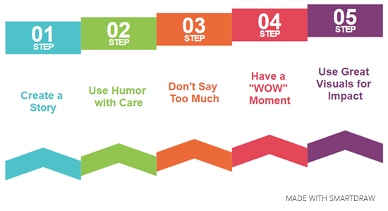
There are five simple ways to do this and the great thing is, anyone can use them.

You'll notice that virtually every TED talk is a story. Why? Because people love stories. It's why reading books, watching TV, and going to the theater are such popular pastimes.
Steve Jobs, one of the greatest speechmakers of all time, used storytelling. He never tried to sell anyone an iPad in a presentation. He created a story that would connect with each person—not about his device, but how his device would change their lives in a wonderful way.
Everyone loves to laugh and everyone loves people who can make them laugh. Find ways to lighten the mood and you'll win them over.
But be judicious about your humor. This is a presentation, not a comedy club routine. Keep it simple and be careful not to offend. A simple rule-of-thumb is that it's okay to joke about yourself or your topic, but never make fun at the expense of someone else.
Keep your talk brief. The brain gets tired after about ten minutes and your audience will suffer fatigue at this point. If you have a 30-minute allotment, break it into three segments. Show a video, do a demonstration, or even have a guest segment with someone else. If your topic is suited for a Q&A session, this is a great way to end a presentation.
Bill Gates gave a TED talk in 2009 about mosquitoes, malaria, and education. During the middle of his speech, as he told the audience about mosquitoes spreading malaria, he opened a jar—and released a swarm of mosquitoes into the auditorium. "There's no reason only poor people should have the experience," he said to a room full of laughter (as he assured them that these particular insects were malaria-free).
You probably won't need that dramatic a "wow" moment, but there should be one point, one picture, or one slide that you can use to drive home your point. Make sure to give it the "wow" factor.
What makes for great visuals in a presentation? There are several possibilities.
Perhaps a photo. If you're talking about a famous person or a special place, a photo can create a wonderful image that connects your message for the audience. Think about those fund-raising commercials with pictures of children or animals. Visuals connect people with their emotions in a powerful way.
Charts or graphs can show data in a highly effective manner, as well. The key here is to keep the data simple—too many facts will become a confusing jumble of information.
Finally—never, ever, use text-based slides and for goodness sake, no bullet-point lists. Your visuals should add impact to your presentation—not a narrative for the audience to try and follow along as you read.
SmartDraw is the best tool for helping you to create an insanely great presentation - it offers mind maps and storyboards for the creative process and an array of templates for creating amazing visuals. One of the great things about SmartDraw is that you don't have to be able to draw to use it—everything is automated and simple.